From Scattered to Centralized: A Video Tutorial Hub
Role: Product Designer, partnering with Dev + PM
Platform: Future Snoops
Overview
The sales team loved FS's tutorial videos — but couldn't reliably find them. Feedback surfaced that tutorial content was scattered across the product with no consistent home: one video lived in the homepage hero banner, two more were buried inside MUSE's expanded sidebar (Ask Us Anything, Creator Tools), and a fourth — a deep-dive on runway analytics — couldn't be located by the sales team at all, despite them being confident it existed. If internal sales, who use the product daily, couldn't find their own tutorial content, external users stood no chance.
The Problem
Sales asked directly: "Is it possible to put all of our tutorial videos in one central location, in addition to where they live now?"
The core issue was pure discoverability:
Videos were placed contextually (in banners, in expanded menus) with no single index of what existed.
There was no consistent entry point — a user had to already know a video existed and roughly where, rather than being able to browse.
At least one tutorial had effectively gone missing — technically live somewhere in the product, but unfindable in practice.
Process
Working with dev and PM, the goal was additive, not disruptive: keep every video exactly where it already lived (the banner, the MUSE sidebar) so existing habits and in-context learning moments weren't lost, but layer in a single central hub so nothing depended on a user stumbling onto the right spot.
Key questions worked through in the design exploration:
Where does a "Tutorials" hub belong in the nav so it's discoverable without being intrusive?
How do you introduce the new hub to existing users without it feeling like a disruptive new feature they have to learn?
The Solution
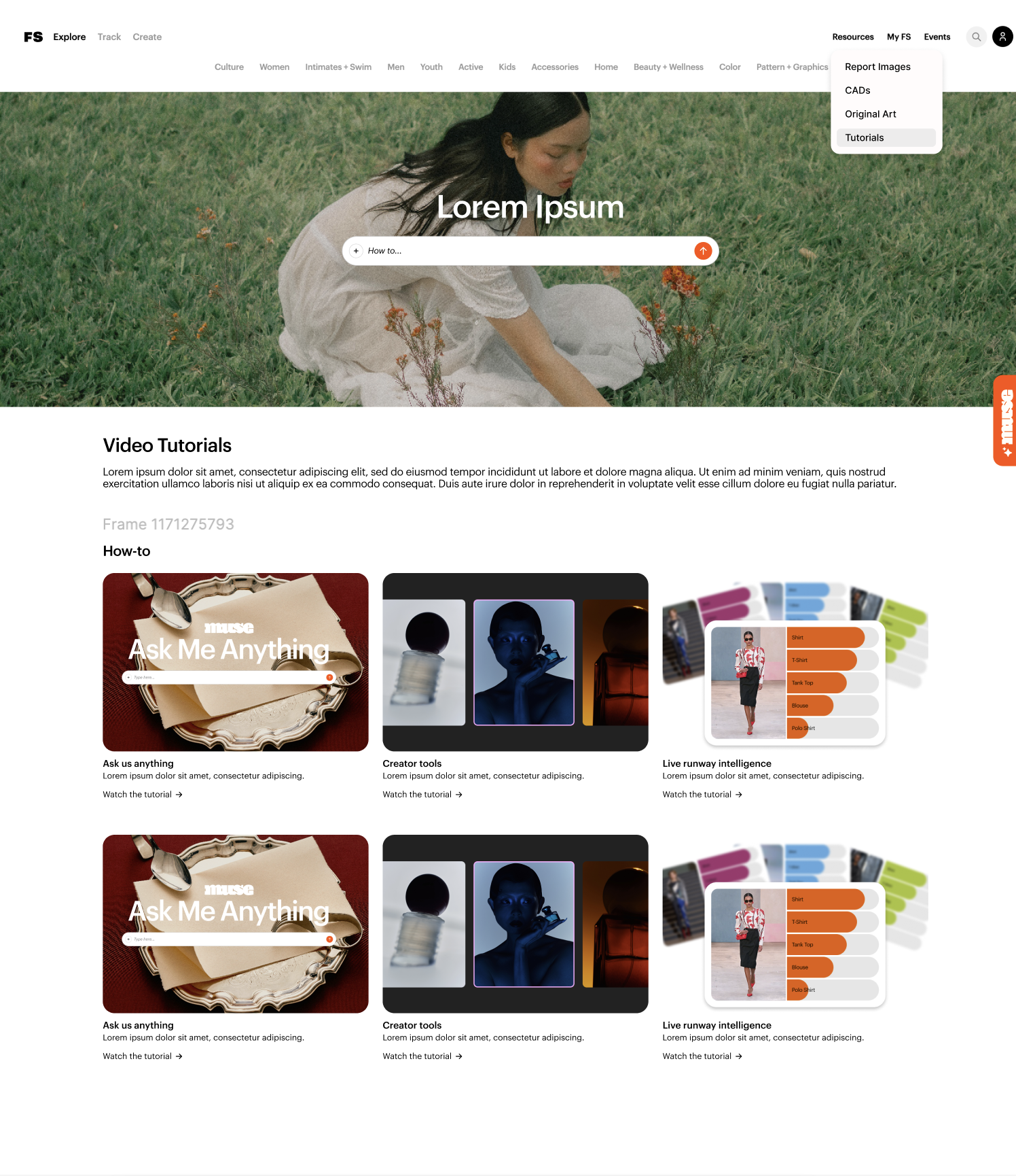
Tutorials added to the Resources dropdown in the top nav, alongside Report Images, CADs, and Original Art — chosen deliberately because Resources is already the place users associate with help and reference material, not a new location they'd have to learn.
A dedicated Video Tutorials page, organized by category (starting with "How-to"), showing every tutorial — Ask Us Anything, Creator Tools, Live Runway Intelligence — as a browsable grid, each with a title, short description, and "Watch the tutorial" link.
In-context links redirected to the hub. Banner CTAs that previously popped a video open directly now link into the video resource area instead — so a user discovering a video contextually lands in the full library, not a dead-end single clip.
An orientation pop-up ("Stay Curious") introducing this section of the resource center on first visit, so existing users understand what changed and why, rather than encountering a new page cold.
Existing placements preserved. The homepage banner video and MUSE sidebar videos stay exactly where they are — the hub is a second, guaranteed path to the same content, not a replacement.
Outcome
This solution is in the design/exploration phase (wireframes shown above use placeholder content), addressing direct, specific feedback from the sales team rather than a shipped-and-measured redesign — so there's no usage data yet to report.