Forecast Timeline: From Fixed Chart to Real-Time Report Hub
Role: Product Designer, partnering with Dev + PM
Platform: Future Snoops
Overview
The Forecast Timeline maps out every trend report FS publishes across seasons (FW 25/26 through FW 28/29) and categories (Women, Intimates/Swim, Active, and more) — things like Color Shifts, Anchor Colors, Product Shifts, and Seasonal Narratives. The original version was a static horizontal graphic: one season visible at a time, fixed dates baked into the layout, no connection to whether a report had actually gone live yet.
As with the Culture Calendar, the goal was to move it off a flat visual and onto the platform as a living, functional tool.
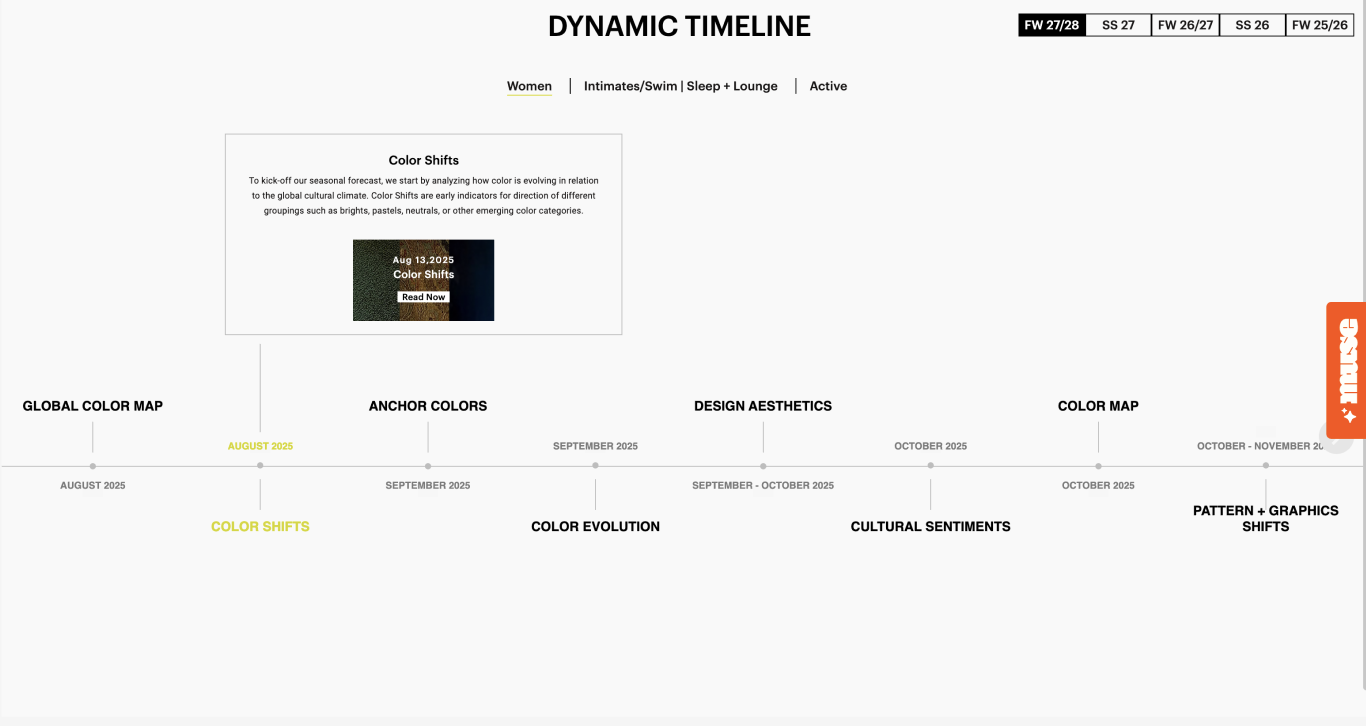
The Problem
The static timeline had two core gaps:
No way to track what had actually dropped. Dates were printed into the graphic as fixed labels, with no distinction between a report that was live and one that was still upcoming — so there was no way to know, at a glance, what you could actually open right now.
No way to get notified. If a report you cared about hadn't published yet, there was nothing to do but keep checking back manually. There was no subscription or alert mechanism tied to individual reports.
Process
Working with dev and PM, the approach mirrored the Culture Calendar rebuild: keep the editorial structure and voice, but make the timeline itself a functional interface rather than a picture of one. Key questions:
How do you show status (live vs. upcoming) per report without cluttering a layout that already branches across multiple categories per month?
How do you let someone track a specific season and category without forcing them to scroll past every other combination?
How do you make "notify me" feel lightweight — a single click, not a form — across potentially dozens of individual reports?
The Solution
The rebuilt Forecast Timeline restructured the flat graphic into a scrollable, branching vertical timeline with real state:
Season and category filters at the top. Two dropdowns (season — e.g. FW 28/29, SS 28 — and market, e.g. Women) instantly reflow the entire timeline to just that combination, rather than showing one fixed season at a time.
Live status per report. Each report card shows either a Live badge with a direct Open link, or Coming soon with its expected date — so status is explicit instead of inferred from a date.
Per-report "Notify me." Any not-yet-published report has its own one-click notify toggle, which flips to Alert set immediately — no form, no separate subscription flow.
Collapsible sections. Each timeline branch (Color Shifts, Anchor Colors, Product Shifts, etc.) can expand or collapse individually, with a Collapse All control for scanning the full season at a glance.
Branching layout retained from the original. The alternating left/right timeline structure from the static version carried over, so the tool still reads as a timeline rather than a flat list — just with live, clickable content instead of printed text.