Behind the scenes of the design
FS Chrome Extension: Save-to-Assets Rebrand
OVERVIEW
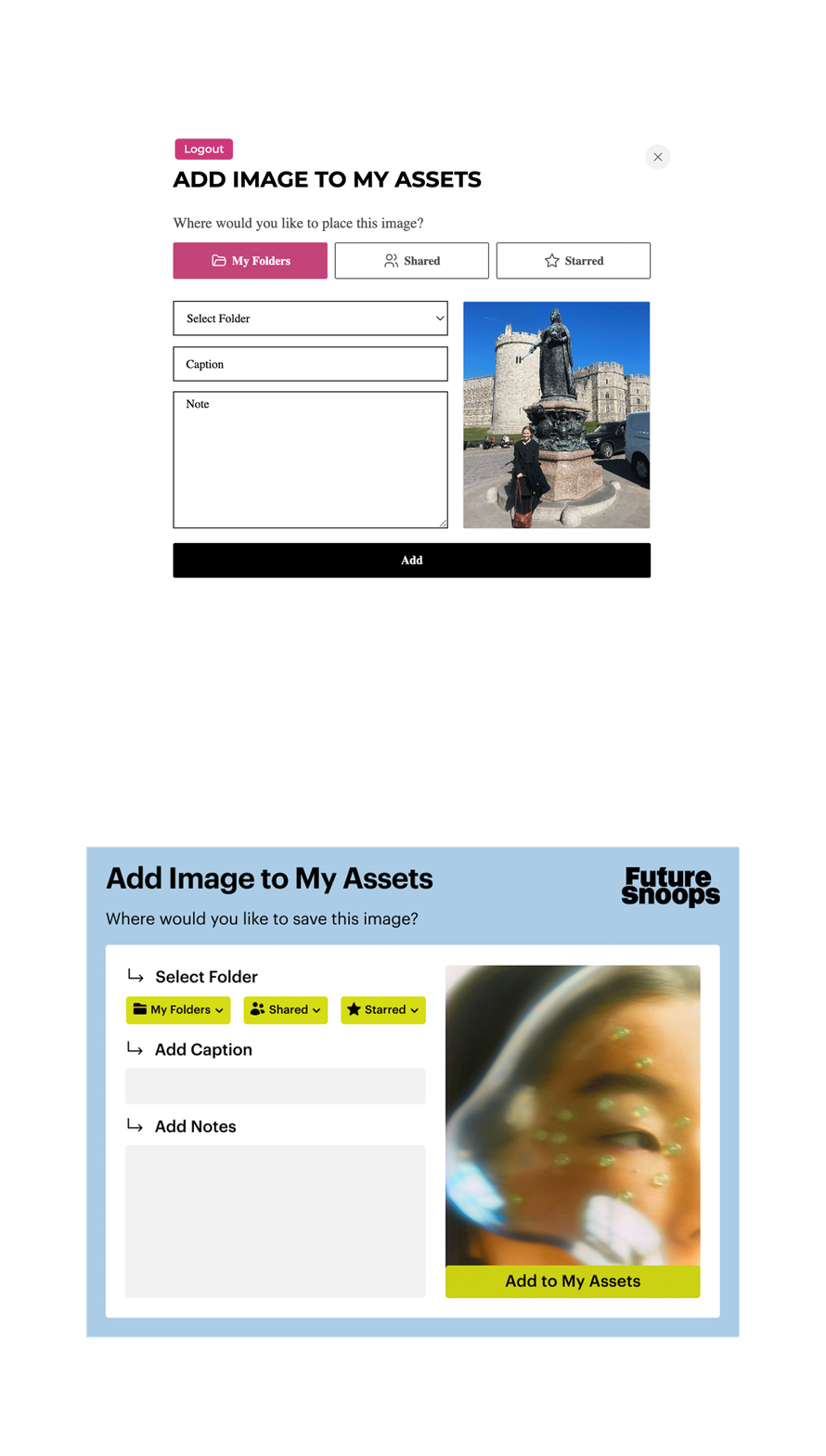
Following an overhaul of the Future Snoops design system, I was tasked with redesigning the Chrome extension's "Add Image to My Assets" popup, along with a new plug-in icon — with the goal of finding an intersection between functional, bold, and creative. The original popup was generic and utilitarian: plain form fields, an unbranded pink accent, no clear visual hierarchy.
Drafts
Exploring the Direction
Before settling on a final look, I drafted multiple versions of the popup against different background treatments — testing how the panel held up over bold saturated color blocks, softer muted tones, and directly over the source image itself. This helped pressure-test the design system's palette in a real product context and confirmed that the panel needed enough visual weight and contrast to stay legible regardless of what image or color it was layered over.
-
Main Idea:
Emphasis on the template of our 4:5 aspect ratio. Creating a balance between the image sizing and the additional functionality. Notably, keeping the red box as a space where the user will see ‘Notes, Captions’ options inferring that will accompany the image chosen.
4:5 Aspect Ratio
Rounded Edges on Text Boxes
Adding Icons to Buttons
Secondary Seasonal Colors:
#ABCCE6 + #E3290A
-
Main Idea:
Emphasis on negative space, and creating a legible option with the ‘Glass Blur’ effect. 4:5 Aspect Ratio
Rounded Edges on Text Boxes
Glass Blur Utilized from Design System
-
Main Idea:
Emphasis on the image being added to ‘My Assets’ and the additional functionality of ‘Notes, Captions, Folders’ playing a smaller role yet still keeping functionality in mind.4:5 Aspect Ratio
Rounded Edges on Text Boxes
Adding Icons to Buttons
Secondary Seasonal Color #66A8DA
-
Main Idea:
Emphasis on the image being added to ‘My Assets’ and the additional functionality of ‘Notes, Captions, Folders’ playing a smaller role yet still keeping functionality in mind. The difference here was adding rounded edges to the main square as well.
4:5 Aspect Ratio
Rounded Edges on Text Boxes
Adding Icons to Buttons
Secondary Seasonal Color #EC9C79
The Solution
The redesign brought the popup fully in line with FS's new visual identity, while sharpening its usability:
Bold, on-brand typography and color. Replaced the generic pink accent and default form styling with FS's signature yellow-green and its bold headline type, so the extension reads as an FS product rather than a bolted-on browser tool.
Directional arrow cues. Added simple arrow markers ahead of each field label (Select Folder → Add Caption → Add Notes) to visually guide users through the steps in order, rather than presenting a flat, undifferentiated form.
Action moved onto the image. Relocated the primary "Add to My Assets" button onto the image preview itself, making it the clear, singular call-to-action instead of competing with the form fields below.
Simplified folder/sharing controls. Condensed "My Folders," "Shared," and "Starred" into consistent, compact dropdown pills instead of large toggle buttons, tightening the layout without losing functionality.