Oak & Willow: A Warmer Take on Sustainable Branding
Role: Brand Identity Designer (freelance/personal client project)
Client: Oak & Willow — Canadian zero-waste, eco-friendly household goods brand
Overview
Oak & Willow sells zero-waste, eco-friendly cleaning and body care products out of North Bay, Ontario. The existing brand leaned on familiar sustainability cues — a script wordmark, soft neutral tones — but didn't have a distinct visual identity to back up the product itself. I was brought on to develop a new visual identity: logo, typography, and color palette.
The Problem
Sustainability branding has a well-worn visual language: green, script logos, kraft-paper textures. It signals "eco-friendly" instantly, but it also makes every brand in the category look interchangeable — and it can read as a little dated or overly earnest rather than something a younger customer would actually want on their bathroom counter. Oak & Willow's products (solid dish soap, shampoo bars, coconut scrubbies) are tactile and a little playful; the brand identity wasn't matching that.
The Solution
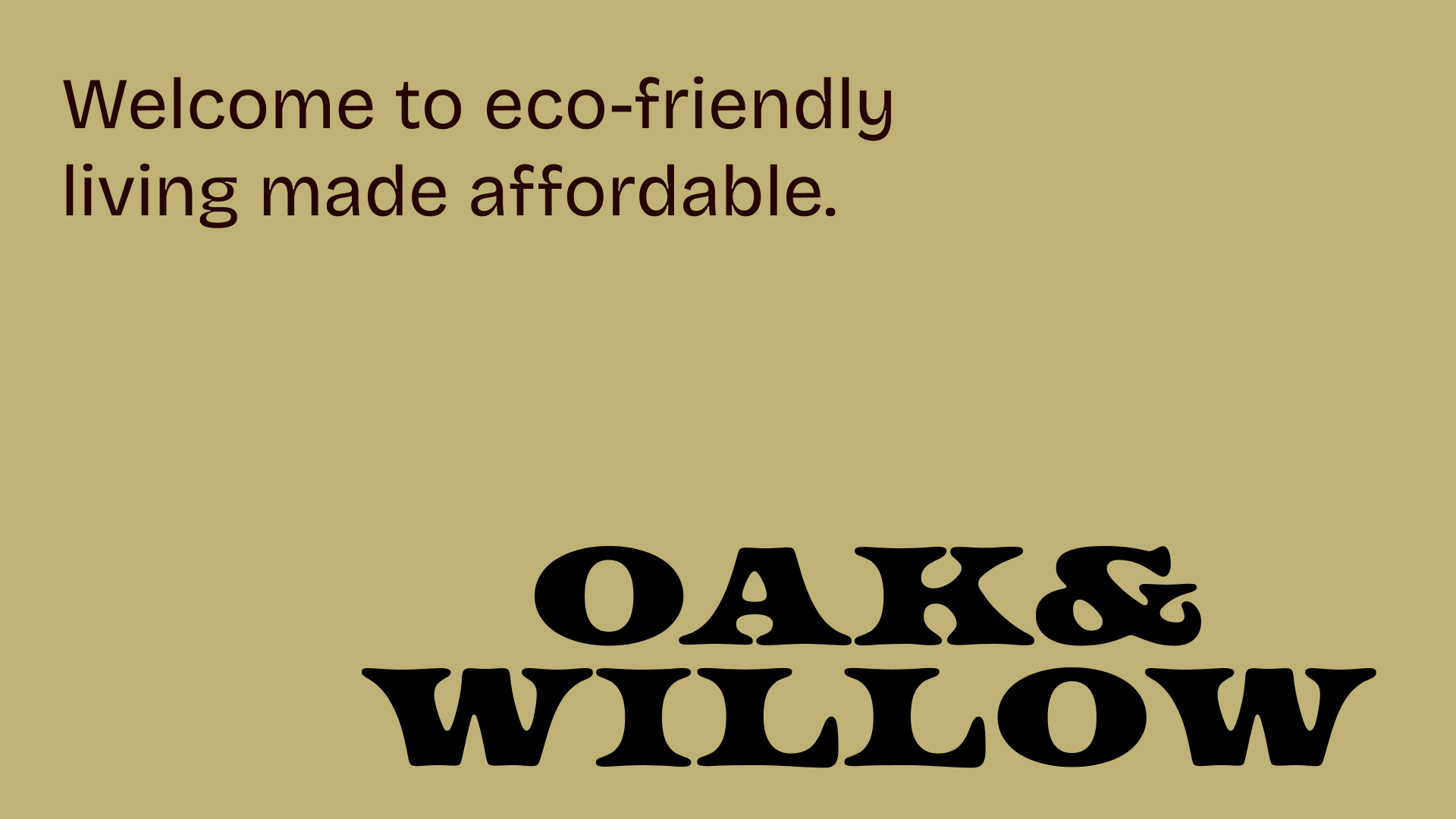
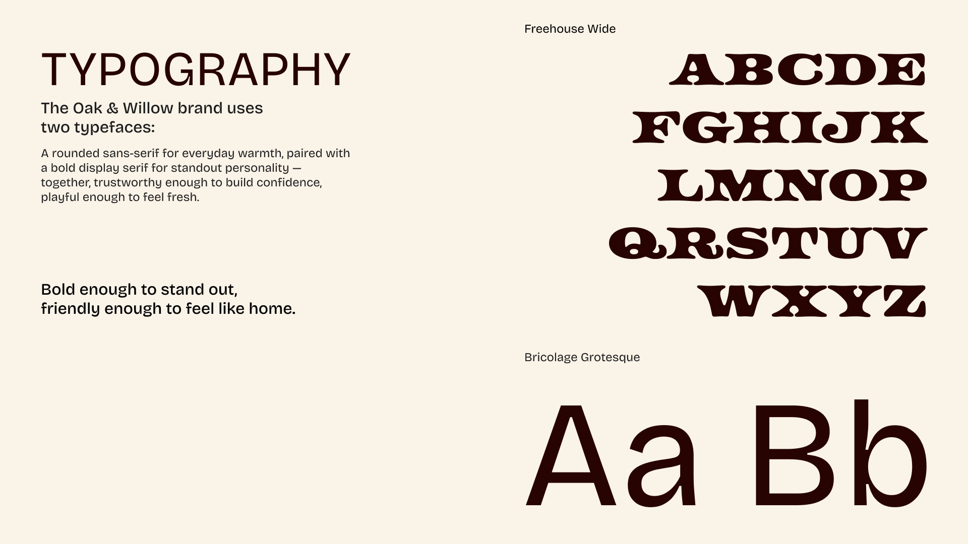
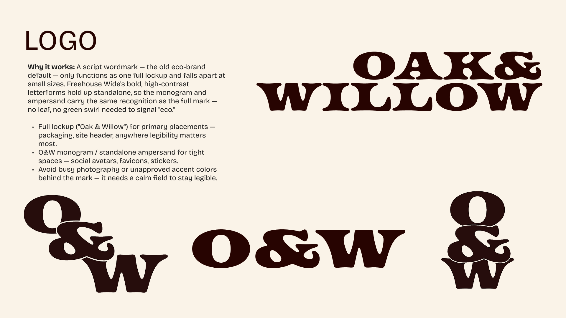
Logo & Typography. The new wordmark pairs a bold, high-contrast display serif (Freehouse Wide) for "Oak & Willow" with a rounded sans-serif (Bricolage Grotesque) for supporting copy. The serif carries most of the brand's personality — it's chunky and a little vintage, with enough character to stand alone as a mark (the "O&W" monogram and standalone ampersand both work as secondary marks). The sans-serif keeps body copy warm and approachable rather than competing with it.
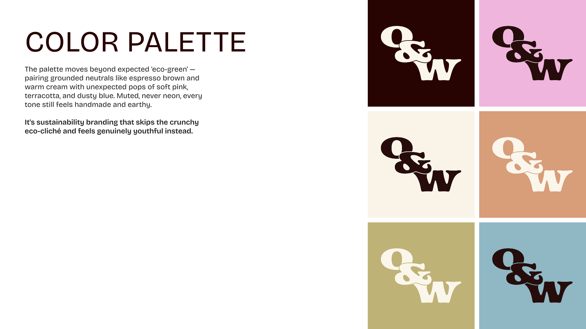
Color Palette. Rather than default to the expected eco-green, the palette centers on espresso brown and warm cream, with soft pink, terracotta, and dusty blue as accent pops. Every tone stays muted rather than neon, keeping the handmade, earthy feel intact — but the addition of pink and blue moves it away from "crunchy eco-cliché" and toward something that reads as genuinely youthful.
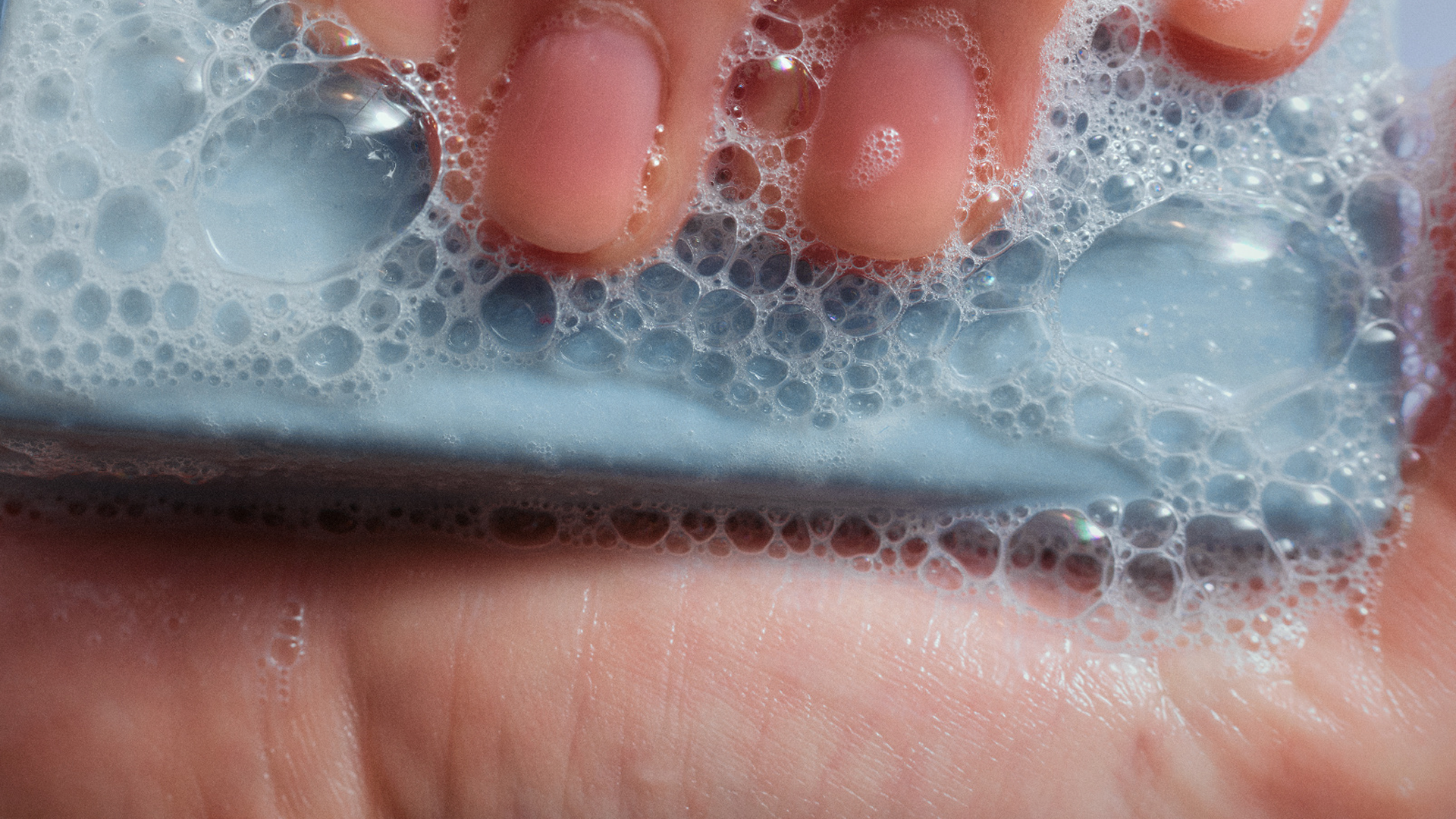
Photography Direction. The accompanying photography direction leans into candid, warm, lifestyle-first imagery — soft natural light, close-up product textures (soap bubbles, wooden brush bristles) — reinforcing the tactile, sensory quality of the products rather than shooting them as clinical product-on-white.
This project is still in progress — the visual identity system (logo, type, color palette, photography direction) is finalized, but application across the live site and packaging hasn't rolled out yet. Next steps are implementing the new identity on oakandwillow.store and product packaging, and gathering feedback once it's customer-facing.