Culture Calendar: From Static Report to Living Tool
Role: Product Designer, partnering with Dev + PM
Platform: Future Snoops
Overview
Every year, the team published a Culture Calendar — a guide to major cultural moments across music, film, TV, art, sports, and fashion, meant to help clients spot licensing and marketing opportunities. It lived as a static, magazine-style PDF: fixed layout, fixed dates, no way to filter or search. Once published in January, it was effectively frozen for the year.
The business wanted it to live natively on the FS platform instead of existing as a downloadable report — turning a one-time editorial artifact into an always-current, interactive tool.
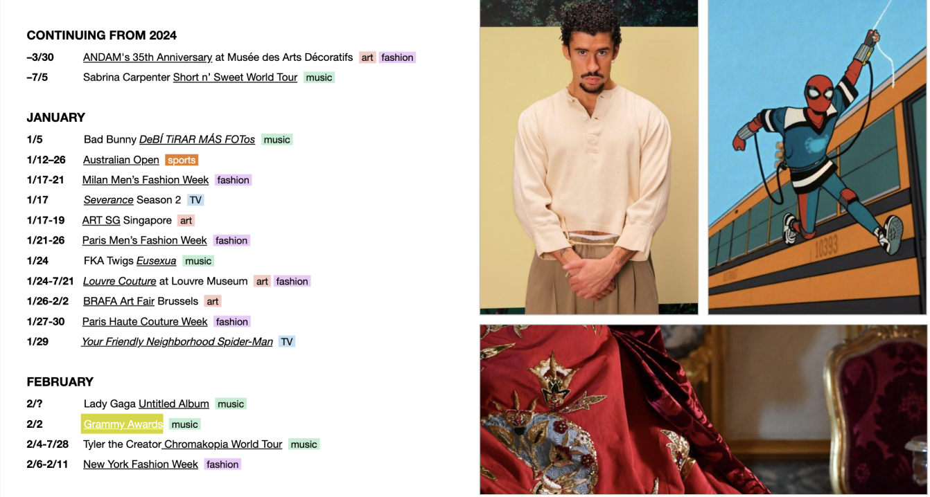
The Problem
The static format created a few compounding issues:
No flexibility. Dates shifted constantly (tour postponements, release delays, awards show reschedules), but the calendar couldn't update once shipped.
No way to filter. A user only interested in music or sports had to scroll through a dense, undifferentiated list spanning every category.
No discoverability loop. There was no way for users to know when new events were added — the document just sat there until someone thought to reopen it.
Disconnected from the platform. It lived outside FS's actual product experience, so it couldn't benefit from navigation, account features, or the surrounding ecosystem of tools users already relied on.
Process
Working closely with dev and PM, the direction was to preserve what worked about the original — the editorial curation, the category tagging system (Music, Film, TV, Sports, Exhibit, Other, Multi), the visual identity — while rebuilding it as a dynamic, filterable page within the platform itself.
Key design questions we worked through:
How do you let someone jump straight to "what's happening in October" without forcing a scroll through nine months of content first?
How do you preserve the tag system from the PDF (color-coded by category) in a way that's also functional — clickable, filterable — not just decorative?
How do you keep it feeling editorial and curated, not like a generic database table?
The Solution
The rebuilt Culture Calendar kept the same visual DNA — warm, editorial imagery; the same category color-coding — but layered in real functionality:
Month index at the top, showing a live count of events per month, so a user can jump directly to any month via anchor navigation instead of scrolling.
Category filter chips (Exhibit, Other, Music, Film, Sports, TV, Multi) with live counts. Selecting a category filters the whole page and updates the per-month counts to reflect just that filter — so someone interested only in Film can instantly see it's concentrated in certain months.
Alternating hero-style and compact list entries for events, so major moments (a WNBA Finals, a Grammy Awards) still get visual weight, while smaller entries stay scannable in a dense list.
Email alerts. A subscription prompt lets users opt in to be notified when new events are added — closing the loop that the static PDF never had.
Native platform navigation (top nav, back-to-top button, platform search) so the calendar feels like part of FS rather than an embedded document.